Bakery App for Shamam’s Macaroons
Mobile app for iOS that allows to place the order with delivery, pick up and dine in.
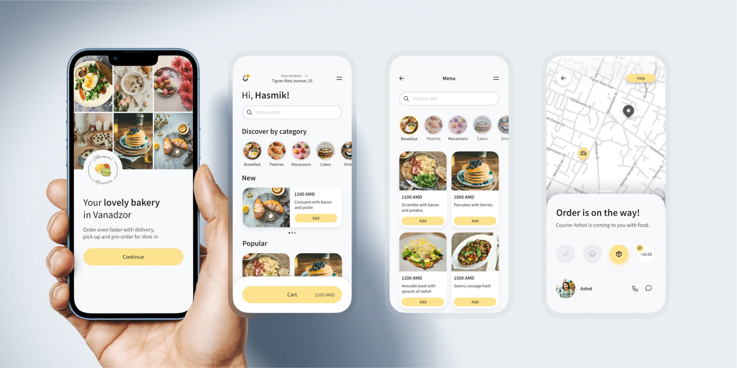
My Role
Product designer
Responsibilities
From concept to delivery including:
UX Research, UX Design,
UI Design, Interaction Design,
Usability Testing
Tools
Case study
Project overview
Introducing Shamam’s Macaroons
As part of my coursework in the Google UX Design Certificate, I decided to design a mobile application for Shamam’s Macaroons, a charming home-based bakery in Vanadzor, Armenia.
Founded just a few years ago, the bakery has been struggling with managing orders efficiently, often leading to long queues and extended wait times. The primary objective of this project was to develop a solution that streamlines the order processing workflow, thereby enhancing the overall customer experience. This app aims to address these challenges by providing a seamless interface for placing orders, thus reducing wait times and improving operational efficiency at Shamam’s Macaroons.
Initial problem statement
Shamam's Macaroons faced challenges with order management, leading to extended wait times and queues, adversely affecting customer satisfaction and operational efficiency.
Initial Solution
Mobile app enabling customers to place orders, aiming to eliminate wait times and streamline the bakery's service process.
Approach
Design thinking process and methods I used during this project
- Observation
- User interviews
- Affinity diagramming
- Competitor analysis
- User personas
- Empathy maps
- User stories
- User journeys
- Storyboards
- Problem statement
- Brainstorm sessions
- Affinity maps
- User flows
- Information architecture
- Crazy 8’s
- How might we
- Wireframes
- Interactive prototypes
- Mockups
- High fidelity design
- Usability testing
- Eye tracking
Empathise
Who is the Target Audience?
Since the primary goal of creating the app is to alleviate the offline service load, I decided to start by observing the bakery’s visitors. I needed to understand who the target audience is and what needs to be done to make ordering through the app their preferred method of placing orders.
What I need to know about customer
- Age
- Gender
- Language
- Use of mobile devices while waiting
- Payment by cash, card or phone
- Openness and sociability when placing an order
- Choice of table (preference for privacy)
- Order type (dine-in, takeout, or pre-order)
- Order amount
Observe to learn more
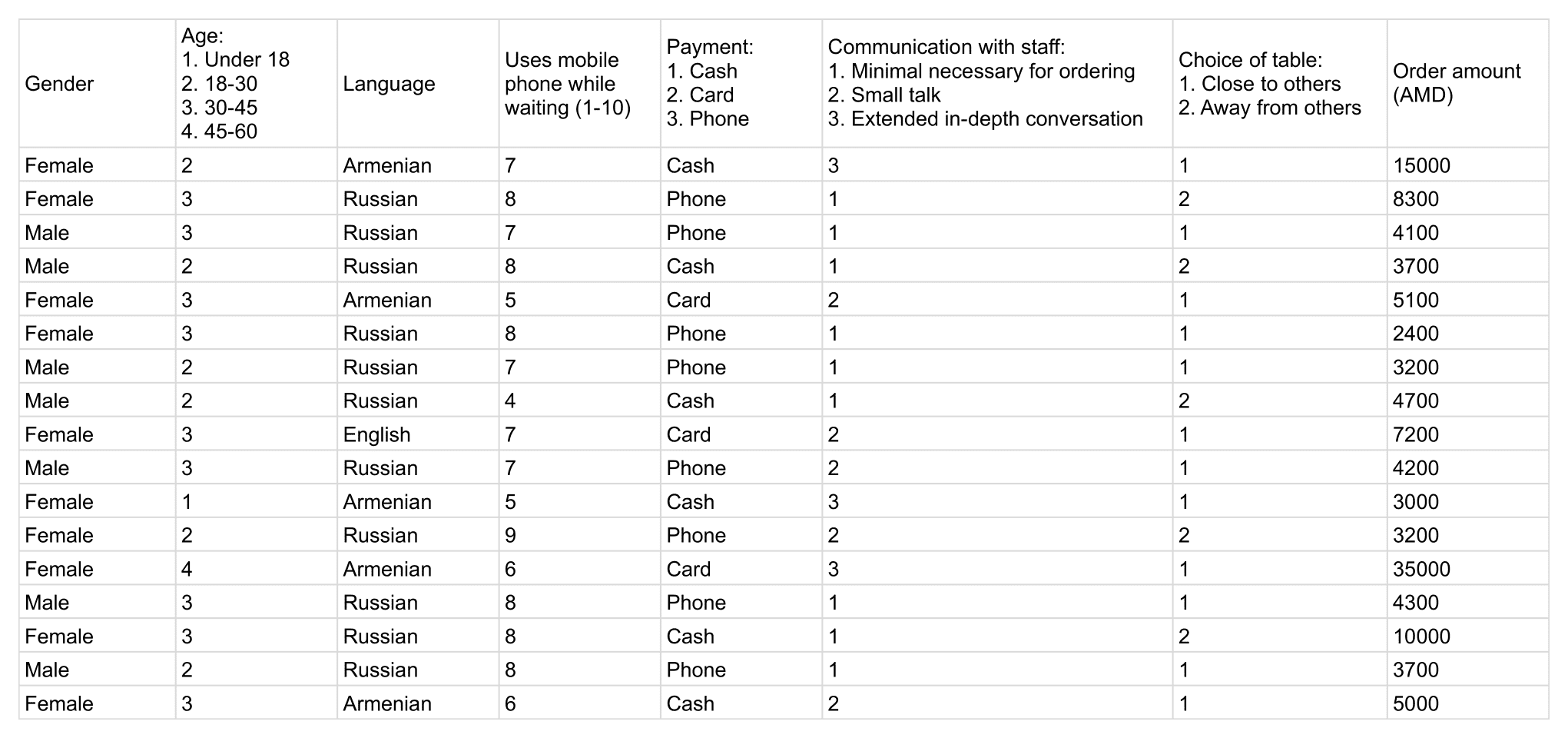
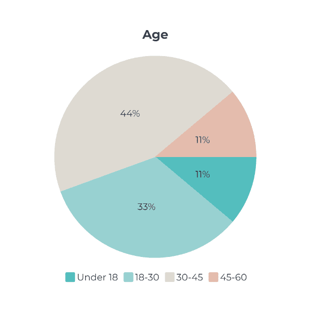
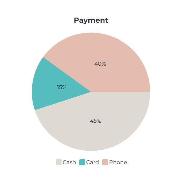
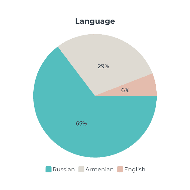
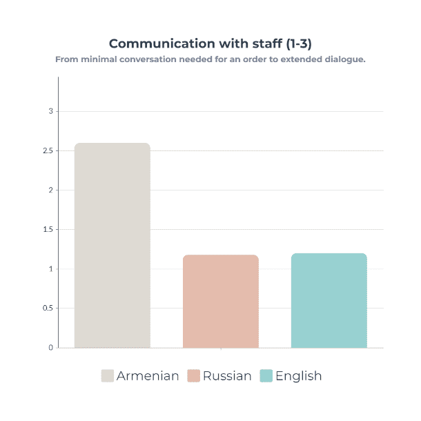
I spent two days in this bakery observing the behavior of visitors and filling up the table with data. One was on a weekday, and the other was on a weekend.
Results
Insights
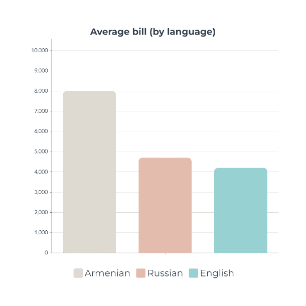
- The average check for Armenian-speaking customers is higher than that of Russian and English-speaking customers.
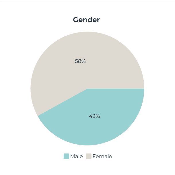
- Russian-speaking visitors constitute the majority among the bakery’s clientele.
- Armenian-speaking visitors are more open to communication and less likely to choose remote tables compared to Russian-speaking ones.
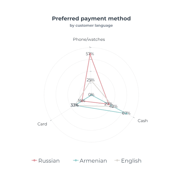
- Russian-speaking visitors prefer to pay with their phone or smartwatches more often, while Armenian-speaking customers tend to pay in cash more frequently.
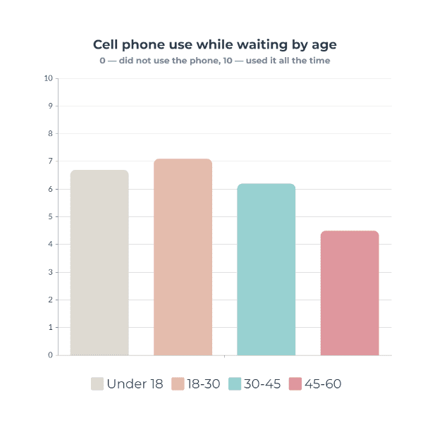
- All visitors use devices extensively while waiting, especially mobile phones, but Russian and English-speaking visitors do so more often than Armenian-speaking ones.
- In the age group of 45-60, there are only Armenian-speaking women; in other age groups, both men and women are roughly equally represented among visitors.
The most interesting part for me was that despite the greater number of Russian-speaking visitors, the average check of Armenian-speaking visitors is significantly higher. I assumed that these user groups have different needs and scenarios for their realization. To find out, I decided to interview customers.
What are the needs of the target audience?
Participant сharacteristics
- Visitors of Shamam’s Macaroon bakery
- From different background (age, language, gender)
I conducted 6 interviews: 3 with Russian-speaking and 3 with Armenian-speaking visitors, 3 male and 3 female, of different ages.
Insights from the interviews
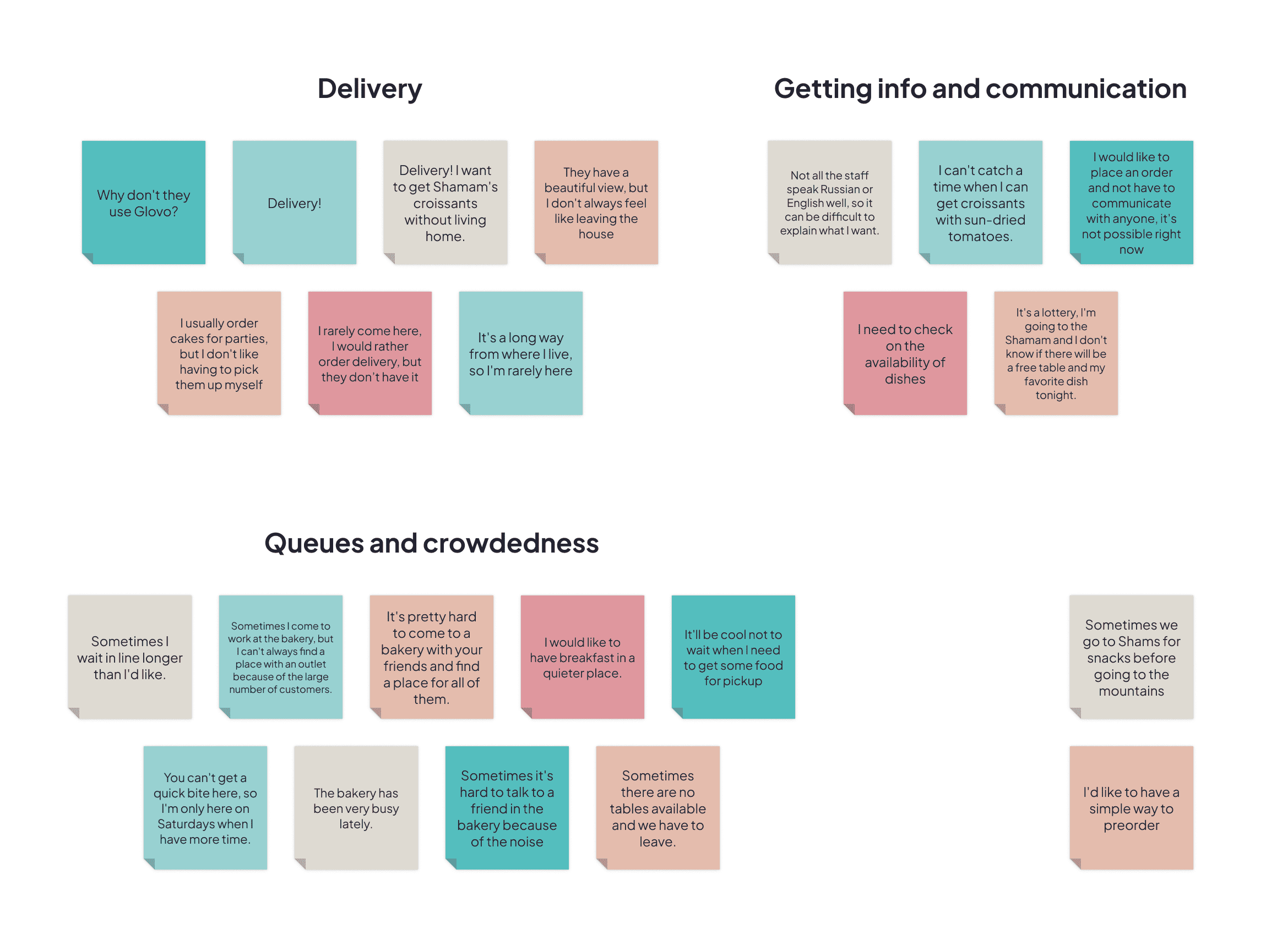
- The queue problem turned out to be very pressing; all respondents mentioned it.
- Many respondents experienced discomfort related to the need to clarify information about the menu and dish availability.
- There is a significant demand for delivery; some visitors order less frequently only because it requires going to the bakery.
- A behavioral difference among different visitor groups was discovered: Armenian-speaking visitors often order sweets for celebrations, while Russian-speaking and English-speaking visitors frequent the bakery for casual snacking.
- Some visitors expressed a need for the option to place orders without the necessity of face-to-face communication.
Who are our competitors?
Market research
I decided to find out who our competitors will be in the digital environment after the app is launched. It turned out that there are no direct competitors in Vanadzor, only a pizzeria that has a website. Therefore, I decided to analyze the digital products of companies from Yerevan to see if there are any peculiarities in the country in general that I should take into account in the design.
Opportunities
- An app with a clean and modern design will distinguish the company among competitors who use outdated and unattractive designs.
- Adding modern payment methods, such as Google Pay and Apple Pay, will make purchasing more convenient for users and serve as an advantage over competitors.
- Using three languages (Armenian, Russian, and English) for the app will make it accessible to all customers.
Define
User story

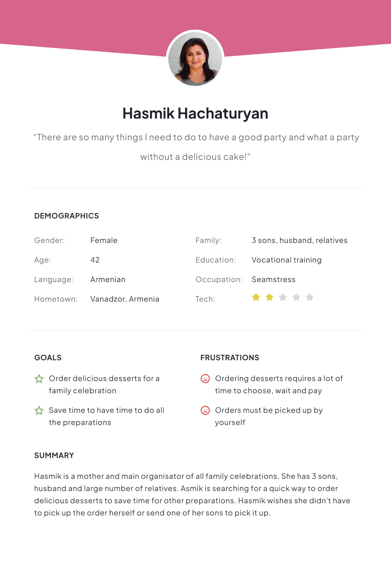
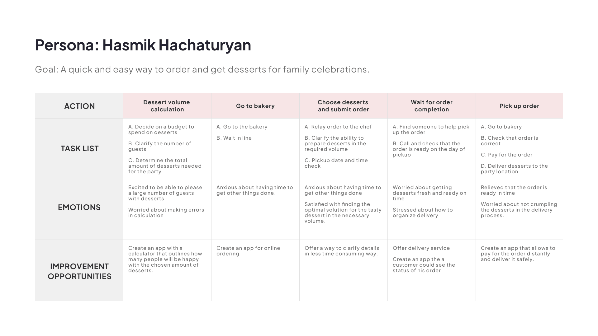
Hasmik Hachaturyan
As an organisator of family celebrations, I want to order desserts with delivery distantly, so that I could save time for other preparations.

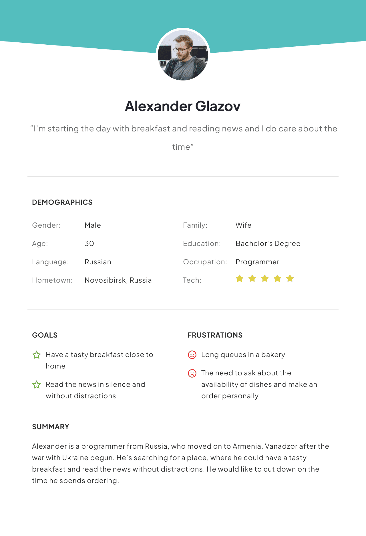
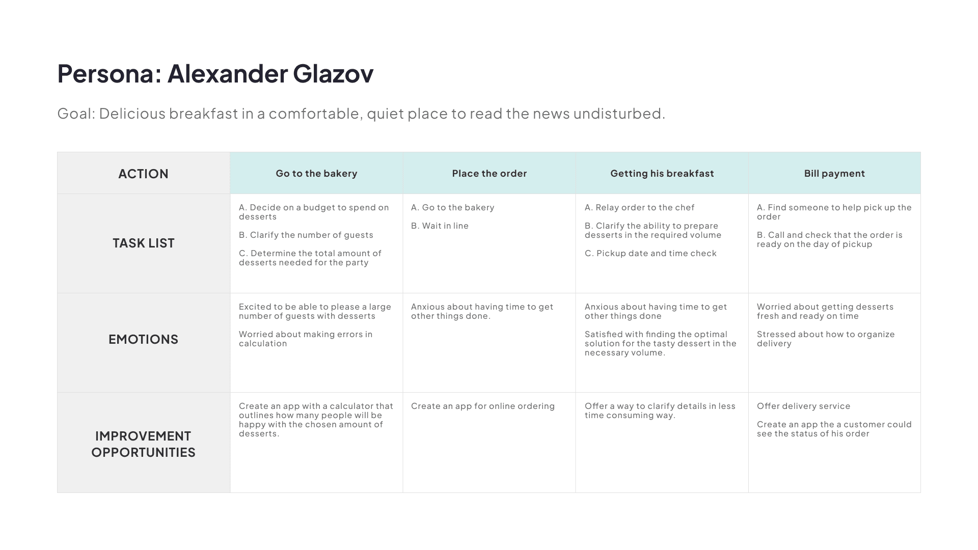
Alexander Glazov
As a relocated IT-specialist and remote worker, I want to pre-order dishes and book place for breakfast and working in advance, so that I can enjoy my breakfast and working without disctraction and waiting.
Problem Statements

Asmik Hachaturyan is a main organisator of all family celebrations who needs quick and easy way to order and get desserts for family celebrations.

Alexander Glazov is a programmer from Russia, who needs delicious breakfast in a comfortable, quiet place, because he wants to read the news undusturbed.
Ideate & Prototype | Rinse & Repeat
How might we...
- HMW streamline the ordering process to make it quick and comfortable for clients?
- HMW we make ordering for celebrations both smooth and quick?
- HMW minimize communication during the ordering process for those who prefer to remain undisturbed?
- HMW ensure clients are guaranteed a table at our bakery upon their arrival?
- HMW we make the ordering process convenient for someone who is not very tech-savvy?
- HMW we improve the experience of a visitor who wants to focus on work?
Focused brainstorming
Finilised value propositions
- Flexible Fulfillment Options:
Choose from delivery, pickup, or dine-in to match your convenience and preference. - Multilingual Support:
Seamlessly switch between Armenian, Russian, and English, making the app accessible and convenient for a diverse user base. - Real-Time Complete Menu Access:
Instantly explore the full menu, featuring up-to-date availability of all dishes. - Enhanced Cart Accessibility:
A prominent cart button at the bottom ensures you’re always just a tap away from reviewing and modifying your order. - Diverse Login Options:
Register or log in through Google, Apple, Facebook, or email, providing flexibility and ease of access. - Real-Time Order Updates:
Get estimated times for your order’s arrival, keeping you informed every step of the way.
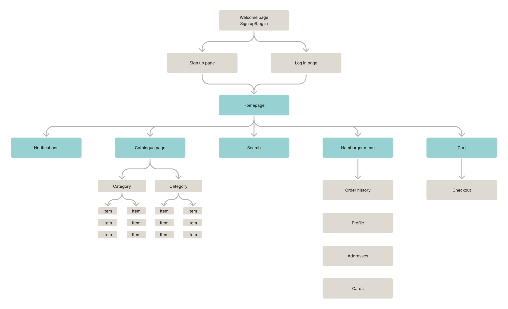
User flow
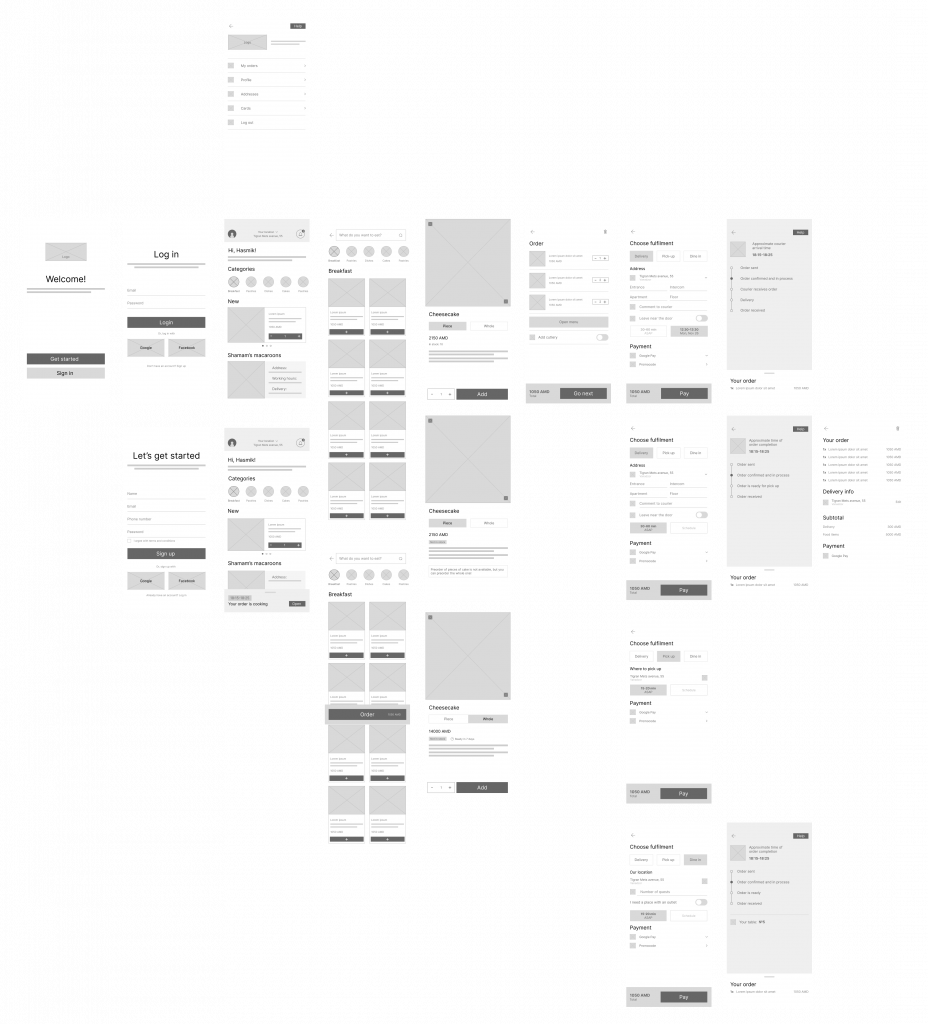
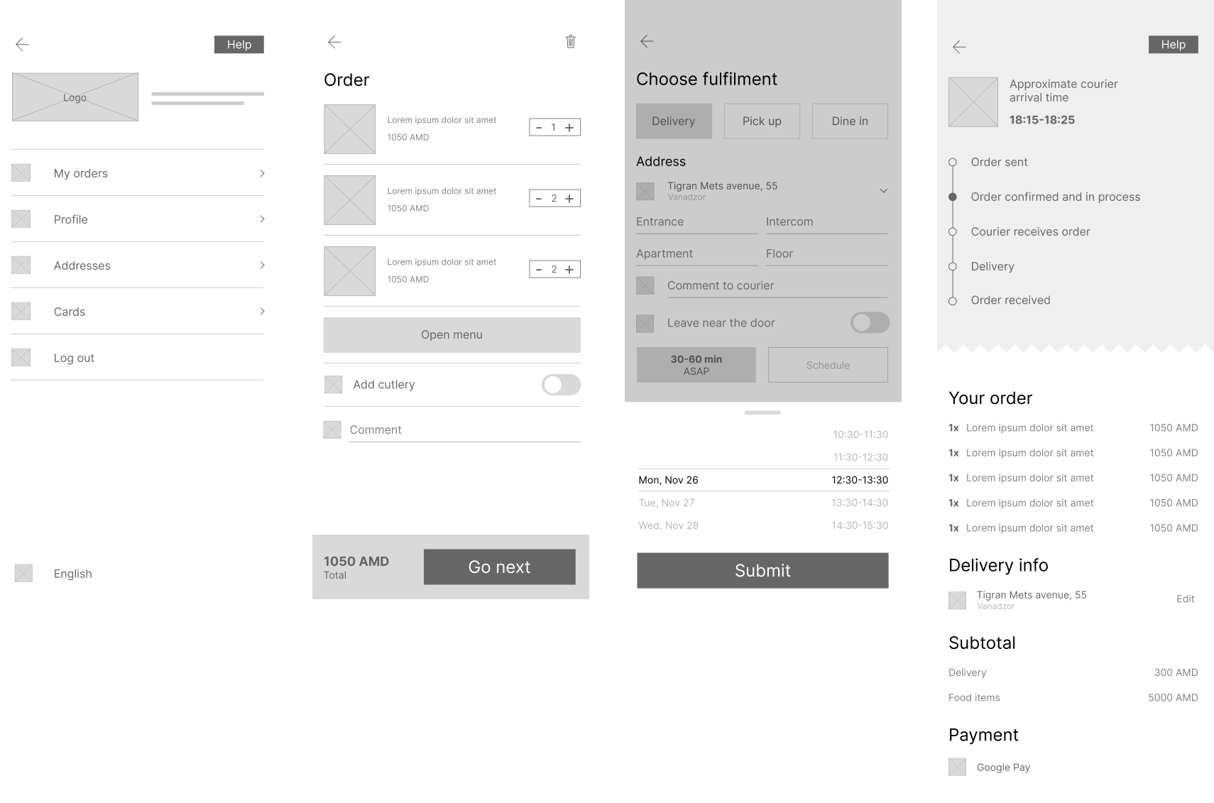
Lo-Fi prototype
UX Research
Research questions
- How long does it take a user to place an order in the app?
- What can we learn from the user flow, or the steps that users take, to place an order?
- Are there parts of the user flow where users get stuck?
- Are there more features that users would like to see included in the app?
- Do users think the app is easy or difficult to use?
KPIs
- Time on task.
- Conversion rate.
- System Usability Scale
Methodology
Unmoderated usability study
Location: Armenia, remote (each participant will complete the study
in their own home)
Date: Sessions will take place during the week of November 26-30, 2023
Length: Each session will last 5 to 10 minutes, based on a list of prompts.
Compensation: No compensation
Participants
- Participants are all Shamam’s Macaroons clients
- Two males, two females, and one nonbinary individual, between the ages of 20 and 75.
Insights from UX study
- Most participants would like to have the opportunity to use the app on their native language.
- Most participants would like to see more usefull way to chose the date for delivery or pickup, that shows avaliable days and time.
- Most participants found separation of order status and order details confusing and prefer to see everything on 1 screen
- Some participants would like to see a field for comments to their order.
Visual Design
Moodboard
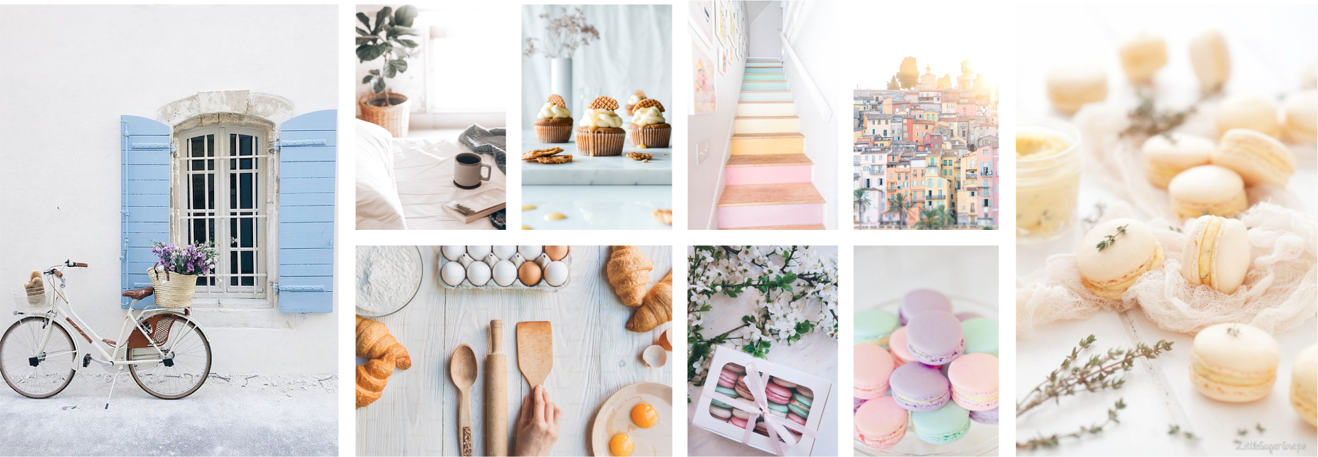
For the French bakery mobile app, I started with a mood board to get a clear idea of the look I was going for. I wanted the app to make people feel something special, just like the light and airy vibe of a French bakery. So, I picked soft pastel colors that remind you of a cozy morning with coffee and croissants, maybe even with a nice mountain view in the background.
Colors & Typography
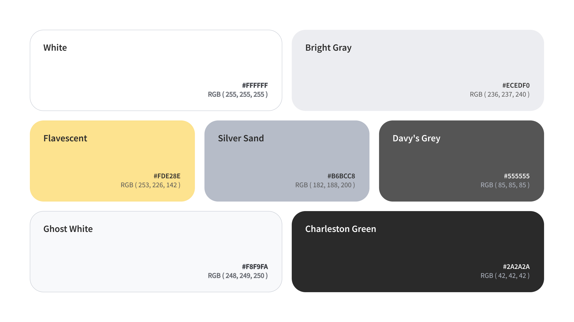
The bakery’s stuff is really bright and colorful, and I wanted to make sure the app shows them off without making everything too busy. That’s why I chose just one color to highlight things and kept the rest simple.
I also decided on a light background for the app to keep everything looking clean and easy on the eyes. This way, the app doesn’t just look good; it also does a great job of showing off the bakery’s yummy treats.
Choosing Source Sans Pro for the app was all about making sure it’s easy to read and looks good. This font is really clear, even on small screens, so everything from the menu to the product descriptions is easy to check out. Plus, it’s got a modern and clean look that fits perfectly with our light and airy vibe. With different weights, we can make the important stuff stand out without making it look too busy. So, Source Sans Pro helps keep the app looking neat and user-friendly, which is just what we need for our French bakery app.
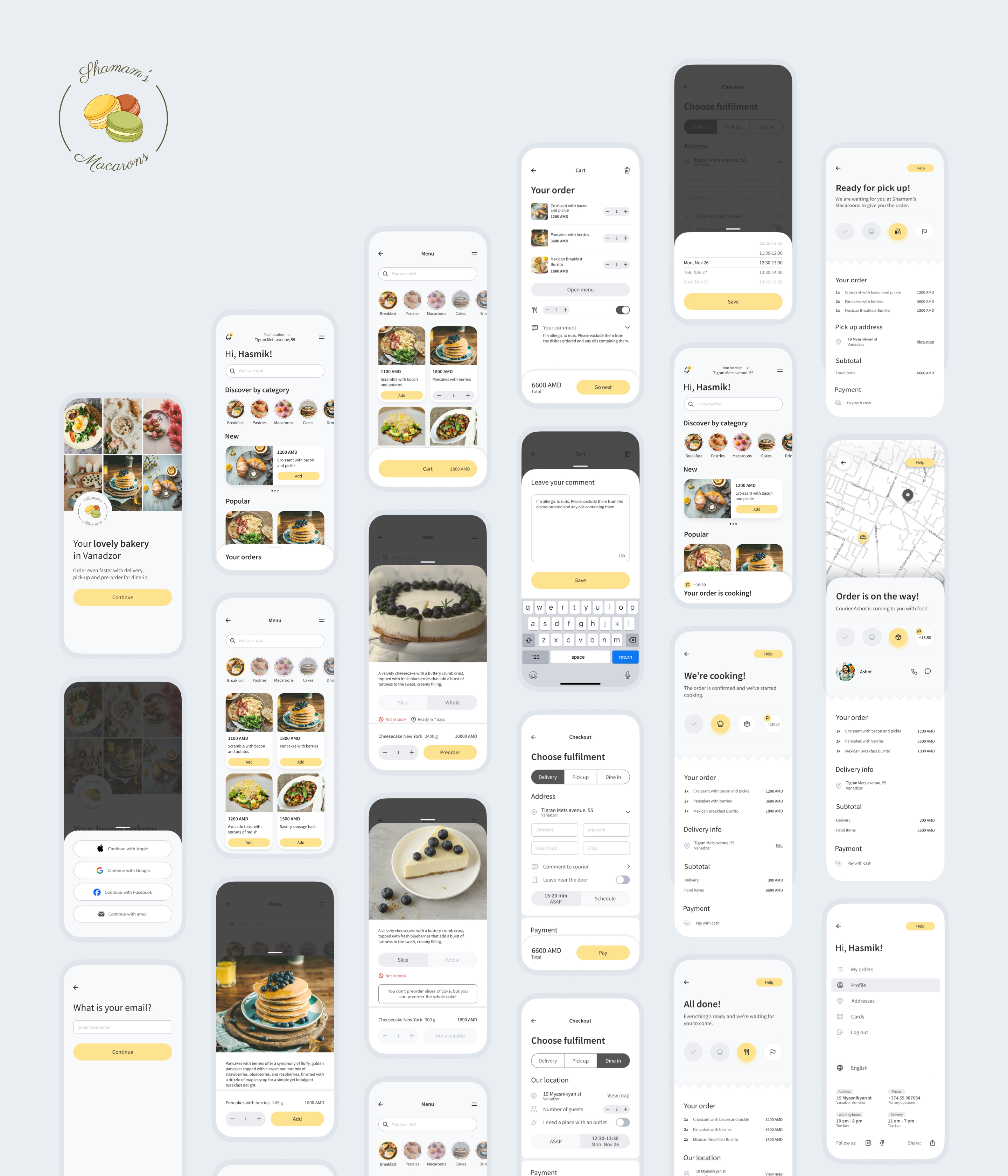
To keep the design looking clean, I maintained consistency and hierarchy.
Results
Key achievements
In this conceptual project, I don’t have tangible results or metrics to showcase the direct impact of my proposed solution. Ideally, in a real-world application, I would have measured critical indicators such as average queue times, daily sales, and user satisfaction both before and after the app’s introduction to gauge its effectiveness.
However, the essence of this project’s success lies in the thorough application of the design thinking process and in crafting an app design that combines aesthetic appeal with functional integrity. While standing out among competitors and offering a potential solution to the bakery’s queuing issues, this accomplishment underscores the value and impact of considered UX design practices.
